deviant art

Deviant Login Shop  Join deviantART for FREE Take the Tour
[x]
Shop Similar Prints
This Print Not Available
more ▶

More from `j3concepts

Featured in Groups:

Details

August 16, 2009
298 KB
1200×1200
Link
Thumb

Statistics

Comments: 29
Favourites: 318 [who?]

Views: 14,844 (0 today)
[x]
:iconj3concepts:
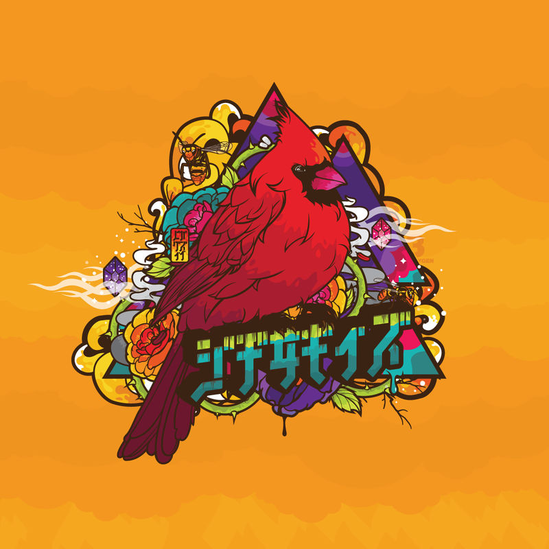
Revision of the original "Temper, Temper". Featured in Jthree Wallpack 2009 available for download exclusively at BloodSweatVector ---> [link]
Add a Comment:
 
love 4 4 joy 0 0 wow 2 2 mad 0 0 sad 0 0 fear 0 0 neutral 0 0
:iconsilverkadett:
Mood: Love ~SilverKadett Sep 26, 2012  Student Traditional Artist
I sort of need this on a shirt.
Reply
:iconsilverkadett:
Mood: Wow! ~SilverKadett Sep 29, 2012  Student Traditional Artist
Neat! Too bad this particular revision isn't available, though. I love the text!
Reply
:iconwolfen-graphix:
*wolfen-graphix May 18, 2010   General Artist
Love it!!
Reply
:iconlemma-axiom:
Very exciting
Reply
:iconlithgrif:
Mood: Wow! ~Lithgrif Nov 1, 2009  Professional General Artist
FantaZtiK!!!
Reply
:iconbuldoz:
My god ! That's fuckin' awesome !
Reply
:iconduocolor:
damn this is high class vector
Reply
:iconkittenbella:
It's so exciting, and beautiful, to watch an artist experiment & grow, and refine & polish their style to the point of owning it, only to then surprise everyone by taking a hard left in a whole other direction- experimenting & growing & refining ... and evolving as an artist yet again.

One of my favorite things about watching your gallery jared, is that you're work is always evolving & always feels new & fresh. I love watching where you take your designs & how your style flourishes & grows. It seems there is sometimes the misconception that an artist is "changing their style," when, again, it is actually a sign of expansion & growth.

That being said, I love the direction your creativity has been taking you- most especially in pieces like this (my favorite), in ANCI's Creative Oblivion, and in Country Club Rerub. I love the fresh new color palette & the use of interesting shapes of various color values to imply highlighting and, especially, shading (look inside the green vines, or the curling yellow elements depicted in this piece). In many areas, the texture resembles like a colorwash- almost even hand-dyed or batik-like- it makes for a very beautiful contrast, flowing within the conversely solid, distinct, clean outlines enclosing it.

I especially love this piece so much (which is why i left my comment here). Obviously, (considering it is the focal point) the cardinal is ravishing &, again, the washes of color are awesome. The whole design is just really solid.
Reply
:iconrafabersi:
~rafabersi Aug 20, 2009  Professional General Artist
cool! you're awesome!
Reply
Add a Comment: